Open Work Session: Celebrity Interaction Project
In Class Critique of Celebrity Interaction Project
Vector Graphics & Illustrator Basics:
Getting to know the work area.
Using tools and palettes.
Drawing shapes.
Creating a vector illustration with Illustrator.
Turning a hand-drawn image or photo into a vector graphic using the pen tool.
Practice: see Week05WorkFiles
Open Workshop: Choose one of the photographic images related to your Concept Collage from Week 02, and using Illustrator draw a representation of that image. You are in effect creating a simple line/shape version of the image. Work on 3 versions of your concept word based on material we have covered in class.
Homework wk05:
A. Personal Logo Design: Makes analog sketches of the initials of your first and last name. You can work with concepts like mirroring, repetition, distortion, & shape overlapping to create some kind of iconic representation of yourself.
Good Logo Design Tips:
- It’s describable
- It’s memorable (The simpler your logo is, the easier it is to remember and so it leaves a stronger impression on people)
- It’s effective without colour
- It’s scalable (i.e. works when just an inch in size)
- It’s appropriate (The viewers must have some idea about the disposition, character, or fundamental values of your company through your logo)
B. Choose two examples: one of a logo and logotype that you think is successful at conveying the concept & identity of the product or service it represents & two a logo and logotype that you think is unsuccessful or ill-conceived. Before class next week, in 50 words or less, explain and critique your choices on our class blog in Week Five. Please email me (before class next week) your two logo samples so that I can post to the blog.
Some Inspiration:
http://www.davidcarsondesign.com/
LOGO LIKES & DISLIKES:
Yuko – http://www.pentagram.com/en/new/2009/02/new-work-the-museum-of-modern.php
…[this was] “helpful in explaining the relationship of logos to institutional branding / identity, and its versatility across different media, as well as showing how it [MoMA] was revamped and reworked in its graphic design projects.”
Sumita
Emilie
Scout
Lawrence
Rachel
Laura
Karina
Carol








I looked at 2 competitors that impact my industry in a big way — Target and Walmart. I particularly like the Target logo and feel it is very effective. It’s strong and impactful and has successfully branded Target to the extent they no longer even need the text — just the red and white logo. On the other hand, Walmart is trying to rebrand themselves and has changed their logo this year from all capital letters to a “softer” lowercase logo in order to reflect the current economic climate as well as reach out to the greener consumer. Although Walmart is doing quite well, I don’t feel as though their current logo is as impactful as Target’s and it doesn’t seem to me that moving from capital letters to smaller letters “softens” Walmart. The new tagline “Save money. Live Better” is an impactful addition, however.
The two that I chose were both for storage companies. One logo was better at communicating the idea of the company through the logo and logotype than the other. The logo for Manhattan Mini Storage is effective because it depicts a little man carrying moving boxes into a small room. The logotype for the title of the company also enhances the effectiveness because it uses the letter “h” and the letter “t”’s in Manhattan to resemble the Empire State Building and and what was once the Twin Towers. This is clever because the storage company is based in Manhattan. Using that design idea in addition to the clear depiction in the logo of someone using the storage facility, the design works well together in tandem to tell the consumer what the company is about and even where it is located. The only problem I saw with this logo is that it is a bit difficult to see what is being depicted when the logo is scaled very small.
http://manhattanministorage.com/
In contrast, the logo for storage deluxe is a bit simplistic and doesn’t clearly communicate the idea of the company. This logo depicts a man holding small box. Out of context with the company name, it doesn’t clearly represent the company as a storage company. The box is so small it could be mistaken for a gift box. Also, the way the man is shown holding the box isn’t how one would hold a box when moving. Rather, it appears to me he is presenting something. As for the logotype, the design doesn’t really communicate anything grand or “deluxe” about the storage company, but instead comes across as plain and generic.
http://www.storagedeluxe.com/
Good Logo Example: Hello Kitty (just the face). I hope it’s ok that I chose an image and not letters — she is so recognizable she does not need letters. Unchanged since 1974. This is the epitome of “kawaii” (cute) that has engendered so many off-shoots ever since. While I’m personally not a Kitty collector, I’m impressed by its timelessness — girls continue to collect Kitty items as adults, as the logo is so malleable it can be used on childish and more “adult” product lines. I read that Kitty’s power lies in her expressionlessness — precisely because she shows no emotion, the owner of her product can ascribe emotion to her. Curious, a bit scary.
Progresso — Ugly fonts, horrible color palette, unappealing vegetables further cluttering the logo. Won’t work without color because the blue is its product identity. It tries to look wholesome and home-made but I cannot disassociate it from the whole industrial processed-foods phenomenon that is now at the center of the food politics debate.
Useful website for logos: http://www.brandsoftheworld.com/
One of my favorite logos and Design house is Yves Saint Laurent. The iconic logo was designed by Adolphe Mouron Cassandre in 1961. This logo is distinctive in its design and although it was designed over 40 years ago it still remains a cultural icon. The logo echoes the luxurious yet simple and modern sentiment similar to the designs of Saint Laurent and although the YSL brand is high-end and not necessarily accessible to the mass, the logo is recognized by many.
To quote Adolphe Mouron Cassandre, “A poster, unlike a painting, is not, and is not meant to be, a work easily distinguished by its ‘manner’ – a unique specimen conceived to satisfy the demanding tastes of a single more or less enlightened art lover. It is meant to be a mass-produced object existing in thousands of copies – like a fountain-pen or automobile. Like them, it is designed to answer certain strictly material needs. It must have a commercial fashion.”
There is no particular logo that comes in mind as ill-conceived however from personal experience I find it interesting how similar the logos’ of the following 2 brands are. Although these are highly recognizable brands the logos can confuse “the eye of the beholder” who might mistake one for the other.
The Chanel logo is an overlapping double ‘C’ – one facing forward and the other facing backward.
The Gucci logo is merged into a circle, back-to-back, inverted, and abstracted.
I mentioned the Nike swoosh in a previous post, but I think it has the strongest corporate logo. It’s immediately identifiable and memorable for athletes and non-athletes alike. Most importantly, it works in all sizes and on all products, from the dominant image on a baseball hat to an embroidered logo on a polo shirt.
My pick for a weak logo is the Weather Channel. A few years ago, TWC ran TV ads that featured people dressed up like sports fanatics, cheering for one weather phenomena to overtake another. Rather than show similar creativity here — or even change up its logo according to the weather like Google.com — the logo is blocky with reverse type and doesn’t reflect its product in any way.
The Havaianas logo is not particularly well known or recognizable, but I think it works well in the context of the brand (a Brazilian company that makes very good flip flops). The color of the type can be changed to suit whatever the scheme of the ad is- pink, yellow, red. I find that the bold, slightly off-kilter, lowercase lettering gives the typeface a fun spirit, which is what should be evoked by the Havaianas product.
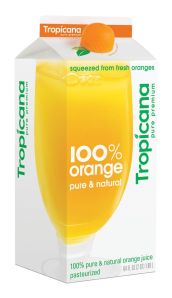
The Tropicana logo re-do is a failure on all fronts. It’s so completely divorced from the old packaging that when I first saw it at the supermarket, I thought the market had stopped carrying Tropicana products. When I got closer, I saw that the mysterious new cartons were indeed Tropicana. My feeling is always- what was wrong with the old logo/type? It was recognizable and iconic. Tropicana screwed up by completely changing the logo; there are no vestiges of the old logo, and that confused a lot of people. Normally, I like clean logos/logotypes, but something about Tropicana’s new look struck me as cheap. They have since gone back to their old logo for most of their products.
The “good” logo I chose is Target. In this case, the logo is so successful that the logotype is unnecessary. The simple yet bold “target” draws an immediate connection between logo and name brand. The logo is also versatile enough for wider branding campaigns.
The “bad” logo I selected is Xerox. Is it similar to Target in shape and color. But whereas the Target logo is eye catching, the Xerox logo is too small and draws no connection between the visual and the brand.
The first logo that I picked is the logo for a small upstart t-shirt company called Johnny Cupcakes. I think the logo design is smart, cheeky, and playful, and is indicative of the clothing line’s aesthetic.
The second logo I picked is for a non-profit called The Sylvia Rivera Law Project, that offers legal services for low income transfolks of color. While the organization itself is awesome and does valuable and exciting work, the logo and slogan they picked for this particular campaign makes liberation seem painfully boring. The logo itself is chaotic, and almost looks menacing. It’s completely unromantic and definitely doesn’t make me want to get involved in their work.
I think the CNN (Cable News Network) logo is very effective in conveying a concrete message. The three red linked letters with a white line running through them gives the impression of a continuous flow (especially with the repeated “N”s). While their logo is literally continuous, their purpose is obviously “continuous coverage” of international news. CNN was established in 1980 and, as its recognizable symbol implies, was the first network to provide 24-hour television news coverage.
I think the logo for Southwest Airlines is nothing particularly enticing. The font is straightforward and simple (which, however, can be very effective at other times), and the icon is a picture of a plane – not very original for an airline company. If I saw that exact image of just the plane without the word SOUTHWEST underneath it, I would definitely not recognize the icon. The logo has no defining features that imply anything about the company (other than it’s an airline – but that is already known via the title).
The Tivo logo is one that I feel is both successful & follows sound design principles. It is simple, recognizable, & describable. It would do fine in black & white and indicates a connection to the television industry. It fits a young & innovative company very well.
A somewhat unsuccessful logo I encountered was for the Wisconsin Tourism Federation. Its a fine logo as far a design principles are concerned, but considering the slang meaning WTF has, more research was warranted.
As an aside, color is an important factor in logo design & I don’t think many of the most recognizable corporate logos would be effective absent color.
It is an interesting coincidence that two of the leading stationers in New York have the name Kate in their title and the color green anchoring the brand – Kate’s Paperie first twenty years ago followed by kate spade in 1993. Kate’s Paperie indentifies as a source for beautiful paper from around the globe, whereas kate spade began as a handbags company and expanded into paper products. I believe that the kate spade logo and logotype is much stronger. For one, its serif type has a much stronger and more classic presence than the Kate’s Paperie sans-serif font. Also, its logotype is centered compactly under the logo as opposed to next to it. The kate spade kelly green is also bolder and makes a stronger statement than the pale green. With its logo, kate spade represents the woman with the geometric suggestion of a K and S. It has even become a pattern in of itself on several handbags and has become known as the “noel” pattern. This is in contrast to the K of kate’s paperie, where there is no known woman behind brand, and an amorphous suggestion of a K, whereas it might be more effective if the lines suggested the outline of a paper envelope. It is interesting to consider that kate spade has become a global brand whereas the scope of Kate’s Paperie is five retail stores in New York.
The two logos I picked are FedEx and UPS mainly based on their color choices. Both are globally recognized companies, however, I feel FedEx’s logo is stronger. The choice of the blueish purple and orange logo image might seem like an odd choice but compliment each other extremely well. I like that their logo font is fairly simple with the bolder colors on a simple white background. FedEx also changes the color of the “Ex” for ground shipping (green), Office (blue), etc. I think this is a clever idea that allows customers to immediately recognize the different services. Bright colors tend to come across as happier and when it comes to delivery it comes across that you’re package will be delivered quickly.
On the other hand, I think UPS picked probably the worst colors for their logo, brown and a yellowish gold. In general I don’t think brown is a good color choice for logos. The logo appears drab, boring, and for whatever reason it comes across as slow to me. When picking a logo not only is the logo and font important but the color is extremely important since colors have certain connotations as well.
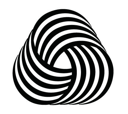
I chose the Woolmark logo as an example of a strong image that has stood up well since its introduction in 1964. Essentially it is a regular triangle with extremely rounded corners – three groups of evenly spaced black lines are intertwined like a mobius strip. The lines diminish in width at the edges of the triangle, and do not quite close the shape, giving the design movement, three-dimensionality, and a bit of tension. It can represent a ball of yarn, paths of fabric, and also communicates strength and vibrance.
The re-branding of the SciFi Channel as “Sifi” is a disaster in its conception and execution. The type is interesting, but the connection to the core product has been lost. The new name doesn’t read as it’s supposed to sound (sih-fee?), it isn’t an acronym for anything, and the new tagline, “Imagine Greater” isn’t related to the name and doesn’t really provide an explanation of what they offer. Apparently, they were somewhat aware that this move wouldn’t be well-recieved, and pre-emptively bought all possible domain variations of “SyfySucks.com”.
A logo that I have chosen is the Campbells soup logo. It has a very iconic look and it contains history behind it. Also, various artist took this logo as inspiration for their art work. It is effective in portraying and representing the product.
Another logo that is very effective is the apple computer logo. It is simple and effective. The logo is clean and simple that it can be apply to various products. It can be used in different colors and display in various sizes. This is a very effective logo.
I chose the target logo as effective, because, it can be inserted anywhere and most Americans instantly know what it is. It also represents a target which hits the spot and that’s how you want to shop. Right on target.
The Cold Stone Creamery doesn’t work as well for me, because it looks generic and makes me think of supermarket ice cream.
Greetings again. When it comes to great logos the first that comes to mind for me is the FedEx logo – it uses only the text, so very very simple and yet the use of bold/block lettering in the font allows for the arrow leading in to the “x”. As for bad logo work, I guess it’s “eye of the beholder” and such but my rule of thumb is when it becomes too busy I’m liable to remember the company for the bad logo before the quality of their product. That said, I am always surprised at how something truly awful gets through quality control at an organization. Cases in point – the Arlington Pediatric Center and Kids Exchange:
http://www.boingboing.net/2005/03/25/pediatric-centers-ba.html
http://www.brandidentityguru.com/wordpress/2008/05/kids-exchange-when-logos-go-bad/.
I think the Beijing 2008 Olympics Logo is very successful. It has strong symbolism and identity. Above the Olympics logo and the words “Beijing 2008”, you can see a very beautiful human form running, and it is a Chinese character in a beautiful simple distinctive brushstrokes. Even if we take the word Beijing out, it would still symbolize the chinese character which makes it unique.
On the other hand, the proposed London 2012 Olympic logo looks very ugly and too-busy and very difficult to understand. The color yellow and pink are both too strong and the font is very tacky. It doesn’t convey or symbolize the spirit of the 2012 olympics – I feel like it is a logo for a rock concert! It also got a really bad response from the public.
Another logo that I think is very successful is the apple logo. It is very easy to remember, colors are plain, simple, highly emotive and to-the-point. The shapes are natural & original which is easily descriptive of the logotype.
Good logos: Nasa & you tube
these logos demonstrate the services provided by the company effectively in my oppinion. One can tell by looking at the nasa logo that it deals with outer space.
Not so good logos: clic hair design & New york philharmonic
These logos, in my humble opinion do not convey what their company does. The philharmonic logo is better illustrated on the right hand side of the image. The image on the left is a little bit boring and doesn’t tell me that it has anything to do with music.